A recommendation opens the door
Users were more willing to explore a service recommended by someone they knew, but that confidence weakened when the next interaction felt generic or promotional.
The Challenge
What Co-operators gave us
How might Co-operators use both digital tools and offline channels to find strong sales leads and identify opportunities across P&C, Life, and Wealth services?
The brief was framed around finding sales opportunities, but our early research pointed to a more human barrier. For young adults navigating insurance independently for the first time, the challenge was not simply discovering a provider. It was feeling confident enough to begin.
Recommendations from family and friends already carried trust. The opportunity was to preserve that trust once the user entered the digital experience rather than losing it inside a generic sales funnel.
Reframing the Brief
Researching Trust, Not Just Transactions
Within the one-week Design Jam, I reviewed insurance and financial-service products, conducted quick user conversations, and synthesized secondary research around digital trust.
Users were more willing to explore a service recommended by someone they knew, but that confidence weakened when the next interaction felt generic or promotional.
People wanted help understanding unfamiliar options before entering a conversation that felt like a commitment to an advisor.
Simple explanations, visible next steps, and control over contact contributed more to credibility than warm visuals alone.
Defining the Opportunity
I focused on recent graduates and young professionals navigating insurance independently for the first time. They want to act responsibly without reading dense policy documents or entering a high-pressure conversation.
I'm exploring insurance for the first time,
understand what to do next and know that trustworthy support is available,
move forward confidently.
Where Confidence Can Break
The Product Loop
The Solution
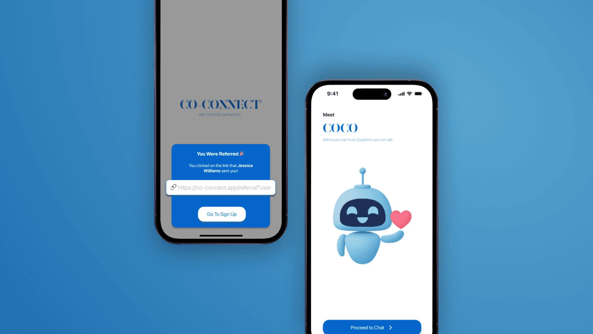
A referred user first sees why they received the invitation. Short onboarding screens explain the service before asking for commitment. CoCo then helps users explore common questions in plain language, while access to a human advisor remains visible when professional support is needed.
Preserve the context behind the personal recommendation.
Why am I here?Help users begin without requiring insurance knowledge.
What do I need?Position AI as a bridge to qualified professional support.
I'm ready.Three Key Design Decisions
What changed
Instead of sending users into a generic landing page, the experience immediately shows that they were personally referred and who the referral came from.Why
The recommendation is what created trust in the first place. Keeping that context visible helps the digital experience inherit some of that confidence.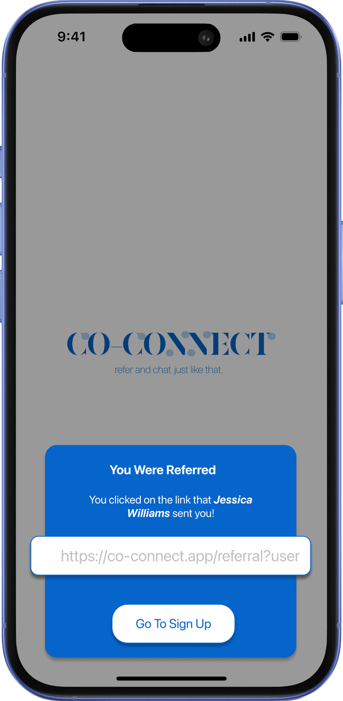
What changed
CoCo pairs an open conversation with suggested actions like Quick Start, Coverage Match, Advisor Chat, and Save Money.Why
Someone exploring insurance for the first time may not know what questions to ask. Guided entry points reduce the effort required to begin.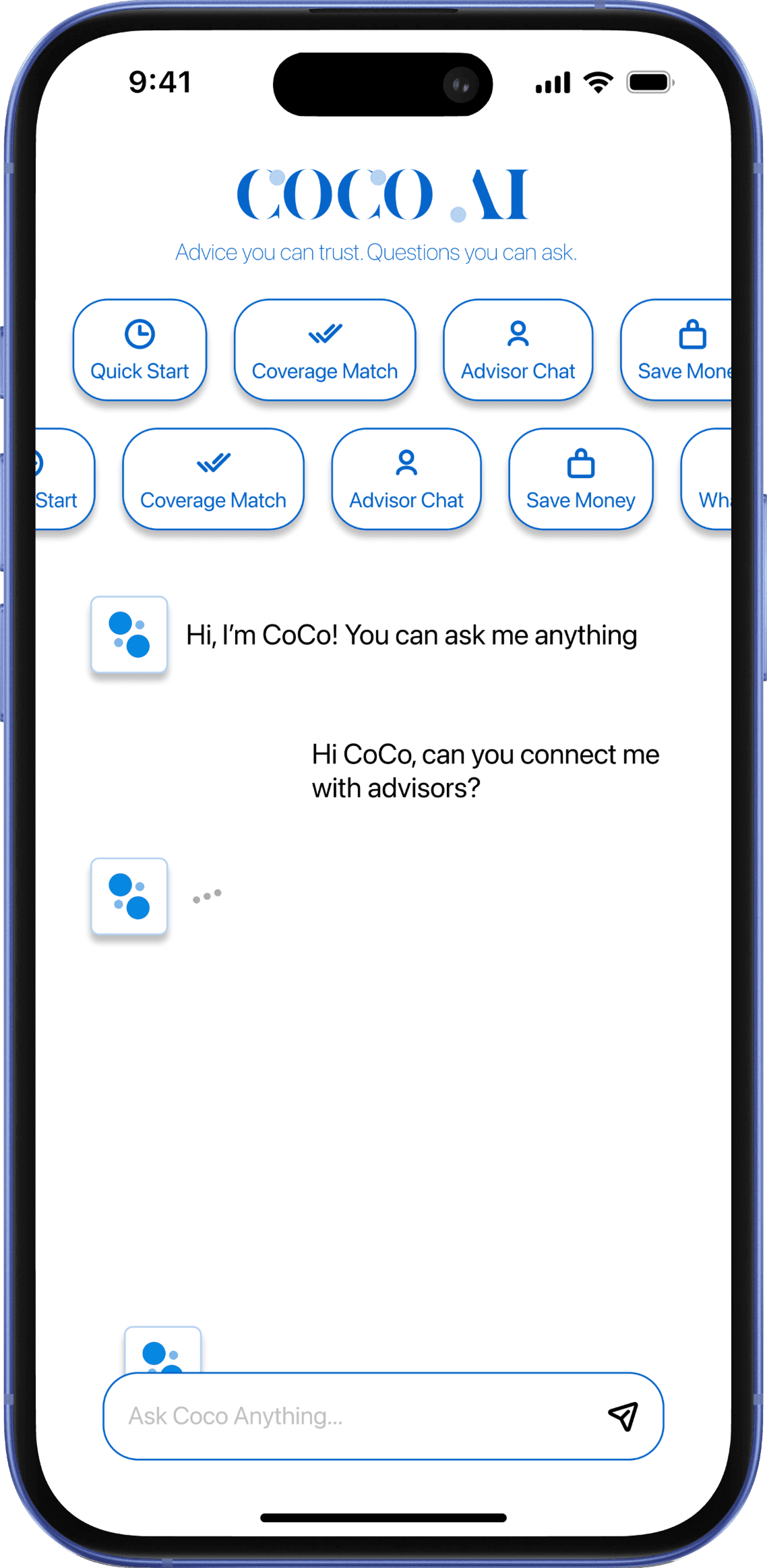
What changed
CoCo is introduced as an approachable starting point for questions rather than presenting itself as the final authority.Why
Giving the assistant a clear role before the conversation begins helps users understand what the experience is for and leaves room for human support when professional judgement is needed.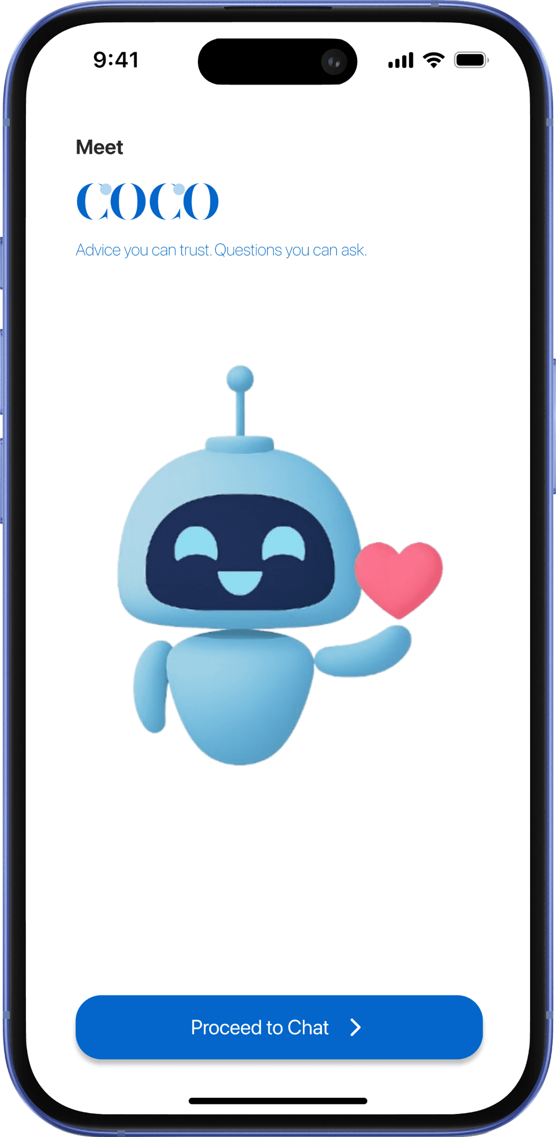
The Final Experience
Rather than treating each screen as an isolated feature, I designed the journey around the questions a first-time insurance customer may have at each step.
Understand why I received this link.
The experience preserves the context behind the recommendation by showing that the invitation came from someone the user knows before asking them to sign up.
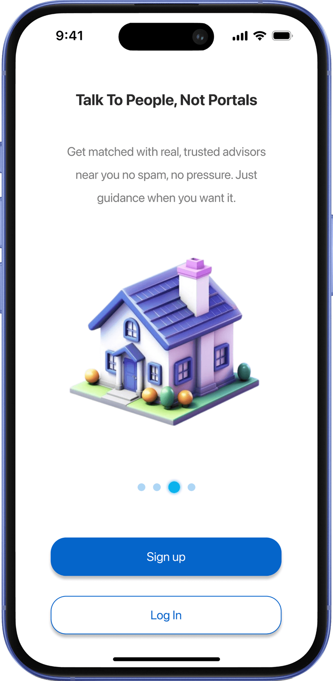
Know how Co-Connect can help me.
Short onboarding introduces the service in plain language and emphasizes access to real advisors, reducing pressure before any account commitment.
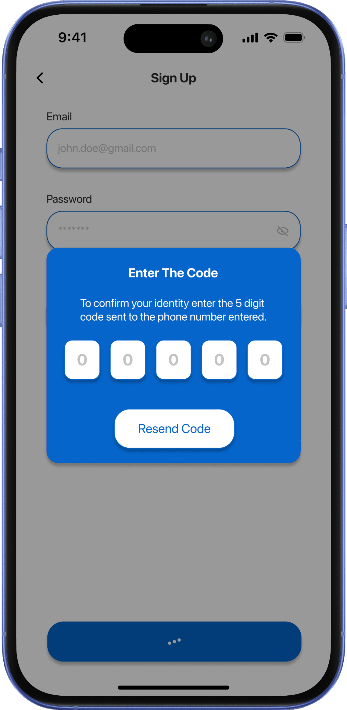
Complete sign-up without uncertainty.
A focused account flow and visible verification step make identity confirmation feel explicit rather than leaving users unsure about what happens next.
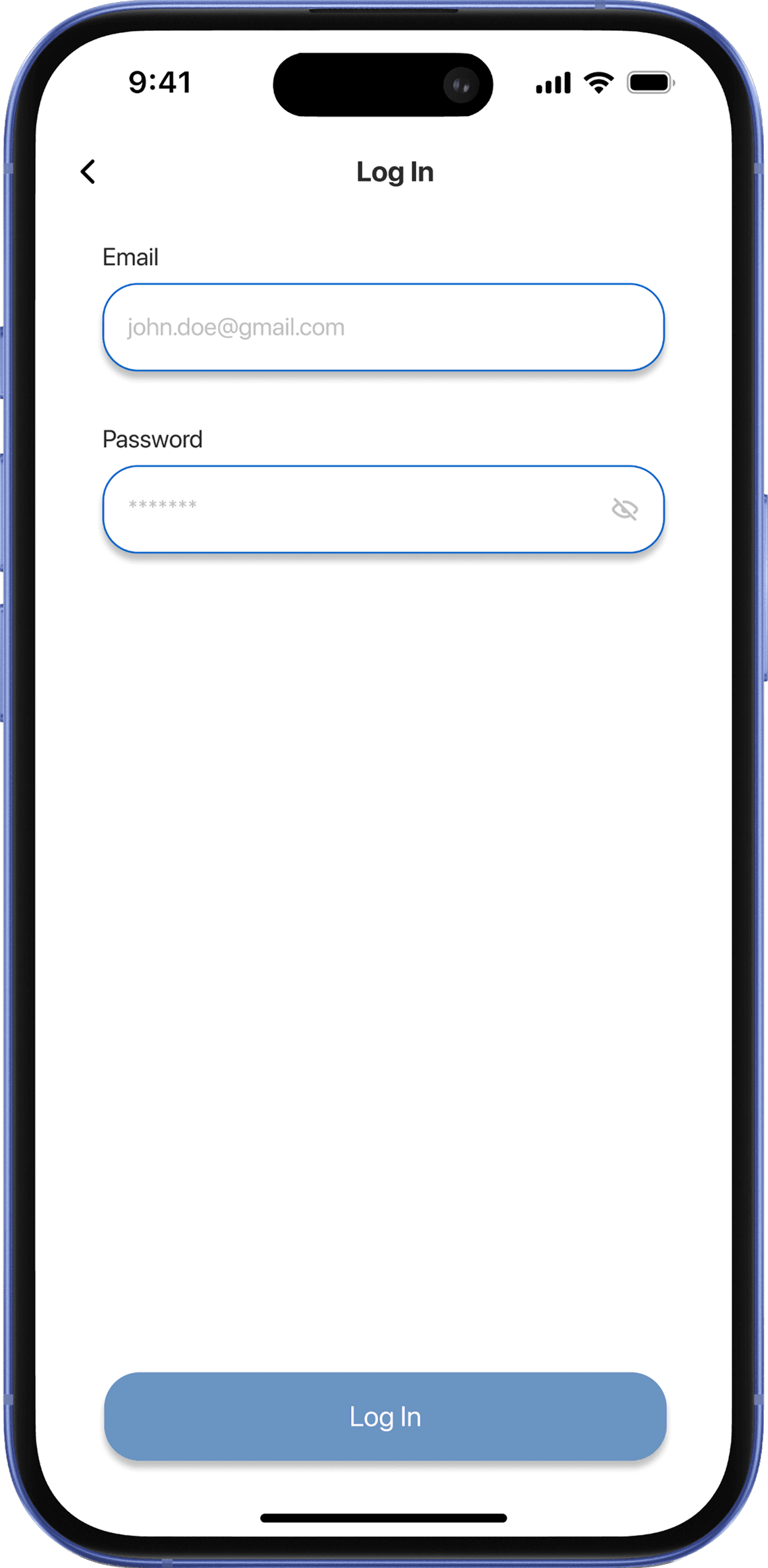
Get back into the experience quickly.
A minimal login screen keeps returning access familiar and straightforward, without introducing unnecessary decisions or distractions.
Understand who is guiding me.
CoCo is introduced as an approachable starting point for insurance questions, setting expectations before the user enters the conversation.
Ask for help even if I do not know what to ask.
Suggested actions such as coverage matching and advisor chat reduce the blank-state problem while still leaving an open field for specific questions.
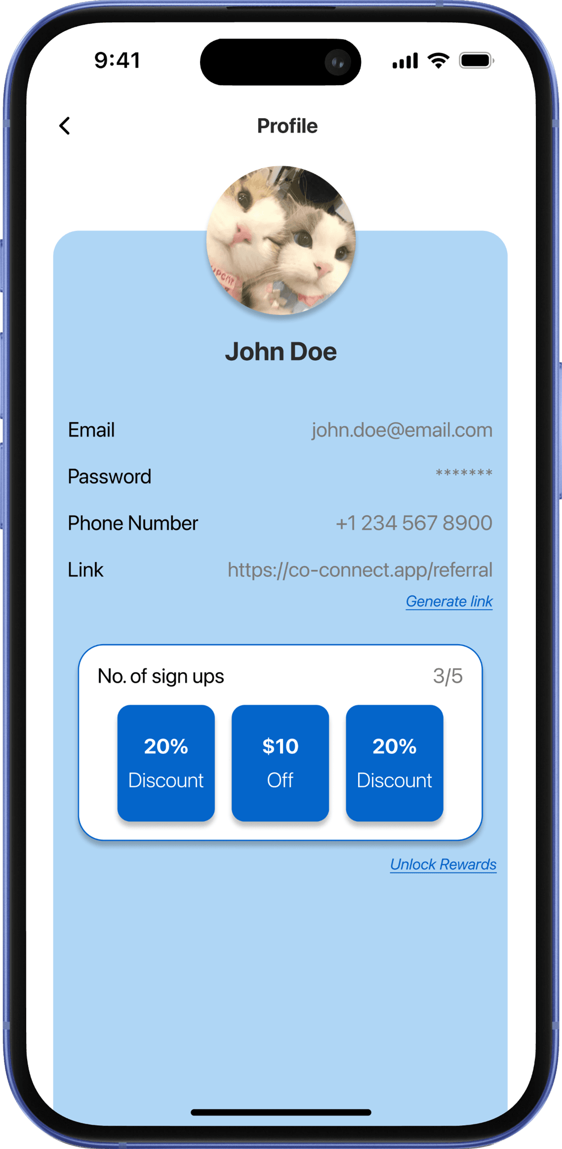
Manage my referral and see what I earned.
The profile brings referral sharing and rewards into one place, allowing activated users to pass the experience on while keeping incentives visible.
Outcome
Within one week, our team developed a research-informed product direction, an end-to-end referral journey, AI-guided support, a human-advisor handoff, and a referral reward loop.
Because Co-Connect was not launched, I would not claim customer or business impact. The award validated the strength of the concept and presentation, while the underlying product assumptions still require user testing.
How I Would Measure Success
The percentage of referred users who receive enough value and confidence to begin a relevant conversation with an advisor.
Recognition
🥇 First PlaceTimeline
One-week designathonFinal Pitch
What I Would Validate Next
I would test whether users understand why they received the referral, what CoCo can and cannot do, and what information is shared during the advisor handoff.
Reflection
What changed for me
I began the project thinking trust could be improved primarily through warm language and approachable visual design. The process showed me that trust depends on how users arrive, when information is requested, how automation explains itself, whether incentives are transparent, and how easily users can reach a human.
What I would do differently
Designing an end-to-end concept helped reveal the larger product ecosystem, but a smaller functional prototype would have produced stronger evidence. In my next project, I would identify the riskiest interaction earlier, prototype it more deeply, and test it before expanding the experience.
View More Projects